Understanding the Power and Application of Venn Diagrams in Finance and Investment
Explore the power and application of Venn Diagrams in Finance and Investment through practical examples and real-life case studies.
Introduction to Venn Diagrams
A Venn diagram is an essential tool used for visualizing relationships between various concepts or data points through overlapping circles. Its origin can be traced back to English logician John Venn, who created these diagrams around the late 19th century to illustrate set theory principles. The power of a Venn diagram lies in its ability to represent commonalities and differences between different groups, making it an invaluable asset across various disciplines, including finance and investment.
The primary objective of this section is to introduce you to the fundamentals of Venn diagrams, explore their history, and discuss how they are used as an essential tool for understanding the intricacies of relationships between financial concepts or data points.
History of Venn Diagrams:
Venn diagrams can be credited to John Venn, a British logician who introduced them around 1880. These diagrams represent sets through circles that overlap when they share common elements. While the name ‘Venn diagram’ itself became popular in the early 20th century, their conceptual roots date back to Leonard Euler, a Swiss mathematician from the 1700s. Regardless of its origin, Venn diagrams have proven to be an indispensable resource for logicians, researchers, and professionals alike, enabling them to derive insights and understand complex relationships with remarkable ease.
Components of Venn Diagrams:
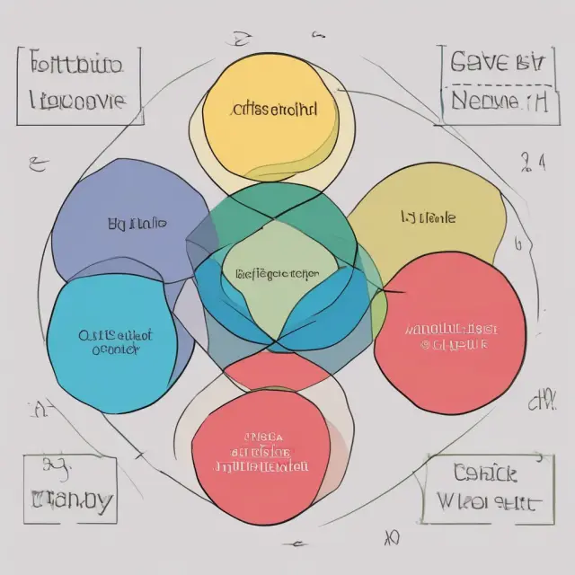
A typical Venn diagram consists of multiple interconnected circles that represent distinct sets. The overlapping areas between these circles show the common elements among the sets. An essential aspect of a Venn diagram is its ability to illustrate not only similarities but also differences between the sets, making it an efficient tool for problem-solving and data analysis.
In finance and investment, Venn diagrams have been effectively used to compare different financial instruments, sectors, or portfolios, offering valuable insights into risk management, diversification, and overall portfolio performance. In the following sections, we will delve deeper into how Venn diagrams can be employed in various applications within the realm of finance and investment, starting with an exploration of their use for set comparison.
Stay tuned as we unravel the intricacies and power of Venn diagrams in understanding relationships between financial concepts and data points, ultimately providing you with a deepened perspective that sets your knowledge apart from the crowd.

Components of Venn Diagrams: Overlapping Circles
The power of a Venn diagram lies in its ability to visually represent relationships between different concepts or data sets using simple yet effective overlapping circles. A Venn diagram is an essential tool for illustrating the commonalities and differences among distinct groups, providing valuable insights into complex systems and relationships. The basic components of this versatile diagram consist of two or more intersecting circles, each representing a set with its own unique characteristics.
The most fundamental aspect of a Venn diagram is the use of circles to denote individual sets, which could be anything from concepts and variables in mathematics to groups and subsets in various disciplines like finance, economics, and data analysis. When two or more circles are drawn and overlapped, the intersections between them represent the shared elements or commonalities within these sets.
The overlap of circles can signify several things depending on the context, including unions (all elements present in both sets), intersections (elements that belong to all sets), and complementary sets (elements unique to one set). These relationships help users understand how different concepts relate, providing a clear and concise visual representation that enhances the learning experience.
The origins of Venn diagrams can be traced back to John Venn, an English mathematician who developed this powerful tool in the late 1800s while studying logic and set theory at Cambridge University. Since then, these diagrams have become a fundamental part of various disciplines and applications, ranging from elementary mathematics education to complex business analysis.
By using a combination of overlapping circles, users can easily compare and contrast different data sets or ideas, gaining deeper insights into their relationships and identifying hidden patterns or correlations. As we dive further into the world of finance and investment, it’s essential to understand how Venn diagrams can be applied to better understand the interplay between various financial instruments, markets, and risk factors, making them an indispensable tool for both professional analysts and enthusiastic investors alike.

Intersection vs Union in Venn Diagrams
Venn diagrams are powerful tools used for understanding commonalities and differences between groups or concepts. They consist primarily of overlapping circles, where each circle represents a distinct set. The ways in which circles intersect provide valuable insights into the relationships among these sets. In this section, we will discuss the significance of intersection and union in Venn diagrams.
Intersection: An intersection within a Venn diagram refers to the area that is common between two or more overlapping circles. This shared region represents the elements that belong to each set in question. Intersections are crucial in identifying similarities between sets and can be computed using various logical operations, such as AND or ∩ in mathematical notation.
Union: The union of two circles in a Venn diagram signifies the total collection of all elements belonging to each individual circle. In other words, it represents every element from both sets combined. Unions are often represented through logical OR or ∪ operations, indicating that every element in either set is included within the larger union.
Intersection vs Union: Which One Should You Use?
Both intersection and union serve essential purposes when working with Venn diagrams. The choice between the two ultimately depends on what specific information you aim to derive from your analysis. Intersections help reveal commonalities among sets, which can be crucial in identifying overlapping markets, shared customer bases, or other valuable insights. Unions, on the other hand, give a more comprehensive view of all elements contained within the respective sets, enabling better understanding of the entire scope of the situation.
A Practical Example: Venn Diagrams and Investment Strategies
Let us consider an example of how intersection and union play out in the realm of investment strategies. Suppose we are examining two different mutual funds – Fund A and Fund B. We want to determine which fund(s) will best suit our needs based on their underlying stocks and their corresponding sectors. In this context:
– Circle A represents all the stocks present in Fund A’s portfolio.
– Circle B represents all the stocks held by Fund B.
The intersection of both circles would then represent the overlapping stocks owned by both funds. This information can be valuable as it allows us to identify which stocks are shared between the two funds and whether they contribute to any redundancies or diversification benefits. By examining the union of Fund A and Fund B, we gain insight into all the unique stocks held by each fund that may not be present in the other, allowing for a more complete evaluation of both investment opportunities.
In conclusion, intersection and union are essential concepts to master when working with Venn diagrams. They provide valuable insights into the relationships between different sets or groups, enabling us to uncover commonalities, differences, and overall trends that may not be apparent at first glance. By understanding these concepts and their applications, we can make more informed decisions in various fields, including finance and investment strategies.

Venn Diagram Applications in Finance: Set Comparison
One of the most common applications of Venn diagrams lies within finance and investment analysis, where they serve as an excellent tool for comparing various financial sets or categories to better understand their similarities and differences. By visualizing how investments overlap or differ across various categories, investors can gain valuable insights into portfolio construction, risk management, and overall market dynamics.
Comparing Stocks, Bonds, or Mutual Funds
Venn diagrams are often used to compare different investment types like stocks, bonds, or mutual funds to identify their commonalities and distinctions. For instance, an investor might use a Venn diagram to illustrate the sectors or industries that overlap between various stock portfolios or exchange-traded funds (ETFs) to determine potential diversification opportunities.
Risk Comparison using Venn Diagrams
A more specific application of this is comparing the risk profiles of different investments through a Venn diagram. By visually examining how the risk factors overlap or differ, an investor can make informed decisions regarding their portfolio’s overall risk exposure and allocate capital accordingly.
Identifying Overlapping Opportunities: Sector and Industry Analysis
Investors interested in sector analysis can utilize Venn diagrams to illustrate the commonalities and differences between various sectors or industries. This insight may help identify potential cross-sector investments, mitigate risk through diversification, and offer a more comprehensive understanding of market trends.
Example: Let’s consider two sectors – Technology and Healthcare. A Venn diagram comparing these sectors could reveal that both have significant exposure to Research & Development (R&D) investments, suggesting a potential area for investment opportunity in companies with strong R&D capabilities across both sectors.
Venture Capital and Private Equity Comparison
Private equity firms may use Venn diagrams to compare their portfolio companies with those of venture capital funds. By examining the intersections and differences between these investments, they can make informed decisions regarding potential acquisitions, divestitures, or collaborations in order to optimize their portfolio performance and risk allocation.
In summary, Venn diagrams serve as a powerful tool for financial analysis by offering a clear and engaging visual representation of the commonalities and differences among various investment sets. By utilizing this versatile diagramming technique, investors can make informed decisions regarding portfolio construction, risk management, and overall market trends.
Venn Diagram Applications in Finance: Risk Management
One significant application of Venn diagrams within finance is risk management and portfolio analysis. By utilizing Venn diagrams, investors can identify potential risks, assess their level of exposure to these risks, and manage diversification within an investment portfolio.
The primary goal of risk management is to minimize the impact of unforeseen events on financial investments. This objective can be achieved through various methods such as diversification or hedging strategies. Venn diagrams provide a visual representation of how these various components interact with each other, allowing investors to make informed decisions about their investment portfolios.
When applying Venn diagrams for risk management purposes, the circles in the diagram represent different asset classes, sectors, or investment options. The overlapping area between two or more circles signifies common risks that are shared among these assets. By examining these areas of intersection, investors can assess their overall exposure to specific risks and potential correlations.
For example, consider a Venn diagram comparing the technology, healthcare, and finance sectors in an investment portfolio. Technology and healthcare industries may share certain risks related to regulatory changes or global economic conditions that affect both industries. The degree of overlap between these circles can help investors determine their exposure to this shared risk and potentially adjust their portfolios accordingly.
Additionally, Venn diagrams can be employed for evaluating the effectiveness of a diversified portfolio by identifying any significant gaps in coverage or excessive concentration within individual sectors. This visualization allows investors to make more informed decisions regarding asset allocation and risk exposure, ultimately reducing their overall portfolio volatility and improving long-term investment performance.
Moreover, Venn diagrams can be used in conjunction with other quantitative tools like correlation matrices to gain a better understanding of how various investments are related and the potential risks associated with them. By integrating this data into their risk management strategies, investors can optimize their portfolio construction, maximizing returns while minimizing risk exposure.
In conclusion, Venn diagrams offer an invaluable tool for financial professionals engaged in risk management and portfolio analysis. By illustrating commonalities and differences among various asset classes, sectors, or investment options, Venn diagrams enable investors to effectively manage their overall risk exposure and maintain a well-diversified portfolio that can withstand market volatility and uncertain economic conditions.
Advanced Venn Diagram Techniques in Finance and Investment
Venn diagrams are powerful tools for illustrating relationships between two or more data sets, particularly useful in the fields of finance and investment. Beyond basic intersection and union analysis, advanced techniques can provide valuable insights into complex financial scenarios. Let’s explore some advanced Venn diagram applications in finance:
Chord Diagrams
Chord diagrams are an extension of Venn diagrams that connect the overlapping circles with lines representing the relationships between the data points within each set. These diagrams help illustrate the relative sizes of various sets and their shared elements, providing a more comprehensive visualization of complex data relationships. In finance, chord diagrams can be employed for portfolio analysis or market segmentation, enabling investors to identify and understand the interconnectivity among multiple asset classes or sectors.
Euler Diagrams
Another advanced technique in Venn diagrams is the Euler diagram. Unlike traditional Venn diagrams that use circles with perfect overlap to represent sets with common elements, Euler diagrams utilize empty spaces to show where sets do not intersect. This approach can be advantageous for finance and investment analysts, as it helps visualize non-overlapping areas and understand the differences among multiple data sets. For instance, in an analysis of different investment styles or industries, Euler diagrams can reveal which sectors are underrepresented or excluded from a particular portfolio, offering valuable insights for potential diversification opportunities.
The combination of advanced Venn diagram techniques like chord diagrams and Euler diagrams with financial data enables more nuanced analysis and understanding of complex relationships among various investment assets, sectors, or market segments. This information can be particularly valuable to institutional investors seeking to optimize their portfolios and mitigate risks effectively.
To create advanced Venn diagrams like chord diagrams and Euler diagrams, there are various software solutions available that cater specifically to the financial industry. These tools allow for more detailed analysis and visualization of complex data sets, making them an essential resource for finance and investment professionals. In the following sections, we will delve deeper into these software applications and their role in optimizing financial decision-making through advanced Venn diagram techniques.
Limitations and Best Practices
While Venn diagrams provide powerful insights into data relationships, it is crucial to understand their limitations and best practices for effective application:
1. Complexity: While Venn diagrams can effectively illustrate simple interrelationships between two or three sets, they may not be ideal for visualizing more complex scenarios with many variables. In such instances, alternative techniques like network graphs, heatmaps, or tree maps might be more appropriate.
2. Data Selection: Choosing the correct data points to represent in a Venn diagram is essential. Ensure that the data is relevant and accurately reflects the relationship you intend to illustrate.
3. Interpretation: The visual representation provided by a Venn diagram should not be the sole basis for decision-making; it serves as a starting point for further analysis, making it crucial to consider other factors and contexts when interpreting the results.
4. Software Selection: Utilizing appropriate software tools can significantly enhance your ability to create and analyze complex Venn diagrams effectively. Select software that caters to your specific financial needs and offers advanced features like chord diagrams or Euler diagrams.
By following these best practices and leveraging advanced techniques like chord diagrams, Euler diagrams, and specialized financial software, you can harness the full potential of Venn diagrams in finance and investment analysis, enabling more informed decision-making and improved portfolio optimization.
Venn Diagram Software: Tools for Efficient Analysis
As the significance of Venn diagrams in various industries continues to grow, it becomes essential for professionals to analyze multiple sets efficiently. Manually creating Venn diagrams using paper or pencil can be time-consuming and laborious. Thankfully, modern technology offers several software solutions that automate this process while offering additional features to optimize analysis. In this section, we introduce some popular tools for generating and interpreting Venn diagrams in finance and investment.
1. R (RStudio): An open-source programming language for statistical computing, R offers packages like Venndiagram and vennDiagram that enable users to create customized diagrams with ease. These packages provide functions for constructing diagrams with different shapes and colors, which can be tailored specifically to financial applications.
2. Excel: Microsoft Excel’s conditional formatting and pivot tables can be used creatively to build simple Venn diagrams. While this method may not support advanced customization features, it is a cost-effective alternative for users already familiar with the platform.
3. IBM SPSS Statistics: This powerful statistical software includes built-in functions like Compare Multiple Means and Cross Tabulate that can automatically generate Venn diagrams. These tools enable comprehensive data analysis while providing additional insights through integrated statistical testing and visualization options.
4. Oracle Discoverer: A business intelligence tool from Oracle Corporation, Discoverer supports the creation of Venn diagrams for large datasets with complex relationships using its advanced data mining capabilities. This tool offers a user-friendly interface that simplifies the process of comparing multiple sets and extracting actionable insights from the results.
5. JMP Pro: SAS Institute’s JMP Pro is a statistical discovery software designed to analyze data, build models, and create visualizations. Its interactive Venn diagram feature allows users to easily compare up to eight sets at once and offers customization options for colors, labels, and layouts.
6. TIBCO Spotfire: This powerful analytics platform from TIBCO Software provides a comprehensive suite of data discovery and visualization tools, including the ability to create Venn diagrams. Its user-friendly interface, extensive integration with other software solutions, and advanced data processing capabilities make it an ideal choice for finance and investment professionals seeking to analyze complex datasets efficiently and effectively.
By integrating these software tools into their workflows, finance and investment professionals can leverage the power of Venn diagrams to gain valuable insights, manage risk, and optimize portfolio performance with increased speed and accuracy.

Limitations and Best Practices for Using Venn Diagrams
Despite their effectiveness in representing relationships between groups or concepts, Venn diagrams do have limitations that financial analysts should be aware of to ensure accurate and useful visualizations.
One limitation involves the number of sets or data points involved. As the number of circles increases, the diagrams can become increasingly complex and challenging to interpret. In such cases, other tools like trees or matrices may be more suitable for analyzing interrelationships between multiple data sets.
Another limitation is related to the accuracy of the data being used in constructing the Venn diagram. Ensuring high-quality and error-free data is crucial to producing reliable and meaningful results. Inaccurate or inconsistent data may lead to incorrect interpretations and misleading conclusions.
When working with large datasets, it might be necessary to sample a representative subset of the data to create an effective Venn diagram. Properly selecting a representative sample requires careful consideration of statistical methods and sampling techniques to ensure that the findings are not skewed or biased in any way.
Another best practice is to clearly label circles and intersection areas with descriptive and meaningful titles, making it easier for readers to understand the relationships between different data sets or concepts. Using colors effectively can also help distinguish between various groups while enhancing visual appeal and clarity.
Professionals working in finance and investment should also consider using software tools to create and analyze Venn diagrams more efficiently, such as Google Drawings, Microsoft Excel, R programming language, or specialized financial analysis software like Tableau or Bloomberg Terminal. These tools can help streamline the process of creating accurate and visually appealing diagrams while providing additional features for manipulating data and customizing visuals to better suit specific analytical needs.
In conclusion, understanding the limitations and best practices for using Venn diagrams in finance and investment is essential for producing accurate, clear, and meaningful visualizations. By being aware of potential pitfalls like dataset size, accuracy, and appropriate labeling, analysts can ensure that their Venn diagrams provide valuable insights and contribute to effective decision-making processes.

Case Studies: Real-Life Examples of Venn Diagram Applications
The power of Venn diagrams in finance and investment lies in their ability to visually represent complex relationships and commonalities between various financial datasets, providing valuable insights for portfolio management and risk analysis. In this section, we delve into real-life examples of how Venn diagrams have been effectively utilized to enhance financial decision-making processes.
1. Comparing Equity Portfolios:
Investment firms often use Venn diagrams when comparing different equity portfolios to understand their holdings’ similarities and differences, ensuring proper diversification. For instance, consider two mutual funds focusing on the technology sector – one heavily invested in US companies while the other primarily targets European tech stocks. A well-designed Venn diagram would display both circles with overlapping areas representing common investments such as semiconductor manufacturers or software firms, enabling fund managers to identify potential redundancies and make informed decisions regarding portfolio allocation.
2. Risk Management:
Risk analysis is a crucial aspect of any investment strategy, and Venn diagrams can help in assessing risks by illustrating the intersection of different risk factors. For example, when constructing a derivatives trading strategy, traders can use a Venn diagram to visualize the relationship between various market events and their potential impacts on financial instruments such as options or futures contracts. By doing so, they gain a better understanding of interrelated risks and can adjust their position accordingly.
3. Market Segmentation:
Market segmentation is an essential aspect of marketing strategy. Companies often use Venn diagrams to identify commonalities between various market segments, enabling them to tailor their products or services to meet diverse customer needs. For instance, a telecommunications company could create a Venn diagram comparing different demographic segments (age, income level, etc.) and geographic regions to optimally allocate resources for marketing campaigns and product development.
4. Mergers & Acquisitions:
Mergers and acquisitions can significantly impact a company’s financial structure and market positioning. Financial analysts often employ Venn diagrams when evaluating potential mergers, enabling them to visualize the intersection of various financial metrics such as revenue growth, earnings per share (EPS), and return on investment (ROI) for both entities involved in the deal. This information allows investors to assess the overall synergy between the companies and evaluate the expected value creation.
By incorporating real-life examples of Venn diagram applications within finance and investment, we can gain a better understanding of their value and versatility in enhancing strategic decision-making processes while minimizing redundancies and identifying potential opportunities for growth.
FAQ: Frequently Asked Questions about Using Venn Diagrams in Finance and Investment
Venn diagrams have been a popular educational tool since their introduction by John Venn over a century ago. However, they also play an essential role in the financial world. In this section, we’ll explore some common questions regarding using Venn diagrams for finance and investment purposes.
1. **What is the main purpose of Venn diagrams in finance?**
A Venn diagram in finance is used to illustrate how different sets of data relate to one another within a larger context, such as comparing two or more investments, sectors, or asset classes. It visually demonstrates commonalities and differences between those sets.
2. **How do I create a Venn diagram for financial analysis?**
Creating a Venn diagram involves dividing your data into distinct categories, represented by separate circles in the diagram. The overlapping regions illustrate commonalities or shared traits among these categories. You can use specialized software to help you create and interpret the Venn diagram effectively.
3. **How is risk management applied with Venn diagrams?**
Risk managers use Venn diagrams to evaluate potential risks and manage diversification within an investment portfolio. By comparing various investments, asset classes, or sectors, they can visually identify intersections with overlapping risk factors or correlations, ultimately helping to optimize their portfolio’s risk/reward profile.
4. **Can I use Venn diagrams for comparing multiple asset classes?**
Yes! Venn diagrams are not limited to two sets. You can include more circles to represent various asset classes or categories and illustrate commonalities, differences, and potential overlaps among them.
5. **What’s the best software for creating financial Venn diagrams?**
There are several tools available that cater specifically to finance professionals looking to create Venn diagrams. Some popular options include Microsoft Excel, Google Sheets, and specialized financial analysis software like R or Python libraries. These solutions can help make the process more efficient and effective.
6. **What is the difference between a union and intersection in a Venn diagram?**
The term “union” refers to the combined elements of two sets (the total sum of each set’s individual items), while an “intersection” represents the commonalities or overlapping areas between those sets. In a Venn diagram, the shaded regions illustrate these intersections.
7. **What is a complement set in a Venn diagram?**
A complement set, also known as a complementary set, is the area outside of any given set within a Venn diagram that doesn’t overlap with it. It represents everything not included within the specific set or sub-set you’re analyzing.
8. **What industries use Venn diagrams in finance?**
Industries such as banking, insurance, asset management, and investment analysis heavily utilize Venn diagrams to make data-driven decisions, identify patterns, and manage risk within complex financial environments.
By addressing these frequently asked questions, we hope to provide a solid foundation for understanding the role of Venn diagrams in finance and investment applications.
 Next entry · No. 5,469Venture Capital-Backed IPOs: A Strategic Exit Strategy for Venture Capitalists and Entrepreneurs
See also
-
 No. 405
21 Apr 2024
19 min
Understanding Bond Equivalent Yield: Comparing Discounted and Traditional Fixed Income Securities
Investments
No. 405
21 Apr 2024
19 min
Understanding Bond Equivalent Yield: Comparing Discounted and Traditional Fixed Income Securities
Investments -
 No. 5,073
09 Aug 2025
21 min
Understanding Trendlines in Finance: Identifying Direction and Predicting Market Movements
Financial Data Analysis
No. 5,073
09 Aug 2025
21 min
Understanding Trendlines in Finance: Identifying Direction and Predicting Market Movements
Financial Data Analysis -
 No. 4,800
17 Jul 2025
21 min
Understanding the Sum of Squares: A Statistical Technique Used in Regression Analysis and Finance
Financial Data Analysis
No. 4,800
17 Jul 2025
21 min
Understanding the Sum of Squares: A Statistical Technique Used in Regression Analysis and Finance
Financial Data Analysis -
 No. 3,446
29 Mar 2025
19 min
Understanding Net Volume: A Technical Indicator for Professional and Institutional Investors
Financial Data Analysis
No. 3,446
29 Mar 2025
19 min
Understanding Net Volume: A Technical Indicator for Professional and Institutional Investors
Financial Data Analysis -
 No. 2,901
13 Feb 2025
20 min
Understanding Line Charts: A Visual Representation of Asset’s Historical Price Action
Financial Data Analysis
No. 2,901
13 Feb 2025
20 min
Understanding Line Charts: A Visual Representation of Asset’s Historical Price Action
Financial Data Analysis -
 No. 2,823
07 Feb 2025
21 min
Leptokurtic Distributions: An In-Depth Guide for Institutional Investors
Financial Data Analysis
No. 2,823
07 Feb 2025
21 min
Leptokurtic Distributions: An In-Depth Guide for Institutional Investors
Financial Data Analysis