Understanding Vertical Line Charting: An Essential Tool for Technical Traders
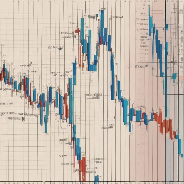
Vertical line charting is another name for the bar chart, or OHLC chart, used in technical analysis. Each period is drawn as one vertical line from the high price to the low price, usually with a small tick on the left for the opening price and one on the right for the closing price.
Correction: This entry first says each vertical line shows the opening and closing prices. In a bar chart the line runs from the period's high to its low; the open is a small tick on the left and the close a tick on the right.
Introduction to Vertical Line Charting
Vertical line charting, often referred to as bar charting or OHLC (open-high-low-close) charts, is a crucial tool in the technical trader’s arsenal for interpreting price movements. This method of visualizing financial data organizes prices for an asset over a specified time period by summarizing each day with a vertical line representing the opening and closing prices (open and close) within that timeframe.
The vertical line chart offers valuable insights into price trends, support levels, resistance levels, and potential trading opportunities. By analyzing these charts, traders can make informed decisions about buying or selling assets based on historical data.
In this section, we’ll delve deeper into understanding how vertical line charting works, interpreting the data it provides, its differences with other types of charts, customization options, advantages and disadvantages, and various trading strategies that can be employed using these charts.
How Vertical Line Charting Works
A vertical line chart displays price information by representing each day or time interval as a vertical line. The height of the line corresponds to the price range during that period (the difference between the highest and lowest prices). At the bottom of the chart, small horizontal lines are drawn under the vertical line for the opening and closing prices, with the open being shown on the left and the close on the right.
The data provided by a vertical line chart allows traders to identify key price levels (highs and lows) over specific time frames. These insights can be crucial when attempting to gauge trends, support levels, resistance levels, and potential buying or selling opportunities.
Interpreting Vertical Line Chart Data
Understanding the information conveyed by vertical line charts is essential for making informed trading decisions. Longer lines indicate significant price movements during the period under consideration, while shorter lines suggest less volatility or indecision in the market. The position of the opening and closing prices within the vertical line can also provide valuable insights:
– If the close (rightmost horizontal bar) is above the open (leftmost horizontal bar), it indicates that buyers were more aggressive during the period, potentially setting the stage for further price increases.
– Conversely, if the close is below the open, sellers dominated the period, which may signal a bearish trend or potential selling opportunity.
Customizing Vertical Line Charts
Vertical line charts can be customized to display various data points (open, high, low, close) based on your analysis needs and preferences. Some traders may prefer more detailed information, while others might find less clutter helpful for their decision-making process. These customization options offer flexibility in the way data is presented.
Advantages and Disadvantages of Vertical Line Charting
Vertical line charting offers several advantages to technical traders:
– Clear visual representation of price movements and trends over specific time intervals
– Easy identification of key support and resistance levels
– Assistance in recognizing chart patterns, such as triangles or head and shoulders, which can provide trading opportunities
– Versatility in customization options for displaying data points
However, it’s important to note that vertical line charts also have limitations. They only provide historical price information and do not inherently forecast future price movements. For a well-rounded analysis, it is often recommended to combine vertical line charting with other forms of technical analysis and fundamental research.
Trading Strategies Using Vertical Line Charts
Vertical line charts can be employed in various trading strategies, including:
- Support and resistance levels: By identifying historical price levels where the asset’s price has found support or resistance (repeatedly bouncing off or reversing at certain price points), traders can use these levels to inform their buy/sell decisions.
- Chart patterns: Recognizing common chart patterns, such as triangles and head and shoulders, may indicate potential trading opportunities based on the historical price movements of the asset.
- Trend identification: By analyzing the direction and strength of trends using vertical line charts, traders can make informed decisions about entering or exiting positions based on current market conditions.
In conclusion, understanding vertical line charting is an essential skill for any serious technical trader seeking to gain valuable insights into price movements and trends over specific time frames. By mastering the interpretation of vertical line charts, traders can improve their decision-making process and enhance their overall trading performance.
How Vertical Line Charting Works
Vertical line charting, also known as bar charting or OHLC (Open, High, Low, Close) charting, is a powerful visual tool used by traders to analyze financial markets. By presenting price information in a vertical format, it allows for a quick and efficient understanding of the market’s behavior.
In this section, we will explore how vertical line charts work, including their fundamental components and interpretations.
The Building Blocks of Vertical Line Charts
Each vertical bar on a chart represents a single trading period – typically an hour, day, week or month. The essential elements of a vertical line chart include the following:
– High Price: The highest price achieved during the specified period. It is represented by the uppermost point of the bar.
– Low Price: The lowest price recorded during the given time frame. This is depicted as the lower part of the bar.
– Opening Price: The price at which the market opened during the specified period. An open horizontal line to the left of the vertical bar signifies this price.
– Closing Price: The final price during the trading session. It is represented by an open horizontal line on the right side of the bar.
Understanding the Significance of Vertical Line Chart Data
The length and position of each vertical bar can provide valuable insights into market dynamics. A long vertical bar implies significant price volatility or a large price range, while a short bar may indicate minimal price movement or indecisive traders.
Interpreting Long Bars: If the closing price is near the high of the bar and the opening price is close to the low, it suggests strong buying pressure during the period. The opposite scenario – a long bar with a large gap between the open and close – indicates robust selling pressure.
Comparing Vertical Line Charts and Other Chart Types
Although vertical line charts are effective in visualizing market data, they have their limitations. For instance, when compared to line charts that plot only closing prices as a continuous line, vertical line charts provide more comprehensive information regarding price swings and trends. However, the choice of which chart type to use depends on individual trading preferences and the specific analysis being conducted.
Stay tuned for our subsequent sections where we will delve into how to customize vertical line charts, its advantages, disadvantages, and popular trading strategies using this versatile tool.

Interpreting Vertical Line Chart Data
Vertical line charts, commonly referred to as bar charts or OHLC charts (Open, High, Low, Close), provide a wealth of information about the price movements of an asset. Each vertical line on the chart signifies the time frame under consideration and is comprised of various components: the opening price, highest price, lowest price, and closing price for the specified period.
Let’s examine each element of a vertical line chart:
– **High Price**: The highest price recorded during the time frame represented by the vertical bar. This price level indicates the peak of the asset’s value during the given period. A high price can signify strong buying interest or potential resistance levels for future price movements.
– **Low Price**: The lowest price recorded during the same time frame. This price level represents the bottom of the asset’s value during the specified period. A low price may indicate weak selling pressure or potential support levels for future price action.
– **Opening Price**: The price at which an asset began trading during the time frame. This price can be crucial in determining whether buyers or sellers dominated the period, depending on how it compares to the other data points.
– **Closing Price**: The price at which an asset closed during the time frame. The closing price is particularly significant as it marks the end of a trading session and provides insights into the overall market sentiment towards the asset. A closing price significantly higher than the opening price might suggest strong buying pressure, while a closing price lower than the open could indicate selling pressure or bearish sentiment.
Long vertical lines represent considerable price swings during the specified period, whereas short lines signify minimal price changes. When interpreting these charts, traders should be aware that longer lines with large differences between opening and closing prices can imply more significant price movements and potential trading opportunities. Conversely, shorter lines may suggest weak buying or selling pressure or a lack of market interest in the asset.
When analyzing a vertical line chart, it is important to remember that each time frame offers unique insights into an asset’s behavior. By combining multiple time frames and employing technical indicators and fundamental analysis, traders can develop more comprehensive trading strategies based on both short-term and long-term market trends.
To better understand the concepts discussed herein, let us examine a real-life example of a vertical line chart for Alphabet (GOOG) over a three-month period:
The chart above showcases how price changes and market sentiment fluctuated during this time frame. The long lines with significant differences between opening and closing prices suggest periods of strong buying or selling pressure, while shorter lines indicate relatively stable periods for the stock. As a trader, you would then evaluate these trends alongside other indicators to determine potential entry and exit points, as well as potential resistance and support levels.
It is essential to note that while vertical line charts are valuable tools in technical analysis, they should not be used alone. Traders should also consider various market conditions, fundamentals, economic data, and other factors when making informed investment decisions.

Difference Between Vertical Line Charts and Line Charts
Vertical line charts and line charts are two widely used tools in stock market analysis, often employed by traders for different purposes. While both types of charts represent financial data visually, they differ significantly in the way they display price movements.
In a vertical line chart, also known as an OHLC (Open, High, Low, Close) or bar chart, each vertical line corresponds to a specific time frame. The high and low prices are represented by the top and bottom of the vertical bar, respectively. The opening and closing prices are shown as small horizontal bars, one on the left-hand side for the opening price and one on the right-hand side for the closing price.
On the other hand, a line chart displays only the closing price over a given time period. Each data point is connected to the previous closing price with a straight line, creating an ascending or descending trend line depending on whether the prices are increasing or decreasing. The openings and highs/lows of each period are not explicitly displayed in a line chart.
Understanding both vertical line charts and line charts is crucial for traders seeking a comprehensive perspective on financial data. Vertical line charts provide more extensive information, detailing the entire range of price movements during a given time frame, while line charts offer an easy-to-follow visual representation of the overall trend direction.
For example, a trader might use a vertical line chart to identify support and resistance levels or chart patterns within a specific time period. Conversely, they may employ a line chart to assess the broader price trend over extended periods. By combining these two types of charts, traders can gain valuable insights into market dynamics and make informed investment decisions.
In summary, vertical line charts and line charts serve distinct purposes in technical analysis, with each offering unique advantages. While a vertical line chart provides more detailed information on individual time frames, a line chart offers a clear view of the broader trend direction over extended periods. Both types of charts can be used together to enhance your understanding of financial markets and make more informed trading decisions.
In the next section, we will discuss how to interpret vertical line chart data for effective trading strategies.

Customizing Vertical Line Charts
One of the advantages of using vertical line charts for analyzing financial data is their versatility. These charts can be customized based on specific trader preferences, with various options including the selection of time frames and data points displayed.
In terms of timeframes, traders can choose to view vertical line charts on a range from intraday (as short as one minute), up to monthly or even yearly intervals. Selecting an appropriate time frame is crucial in identifying trends and making informed trading decisions. For instance, intraday charts are ideal for day traders looking to exploit short-term opportunities, while longer term charts help investors gauge the broader trend direction.
In addition to customizing the time frames, vertical line charts offer flexibility when it comes to selecting data points. Traders can choose to display only specific price information, such as highs or lows, or include all four essential data points (open, high, low, close) for a more comprehensive analysis. For instance, focusing on only high and low values would provide insights into the price range over the selected period. In contrast, an OHLC chart, which displays all the data points, offers a complete representation of price movements during the specified time frame.
Traders often utilize different colors to make their charts more readable and easier to follow. Color-coding vertical bars based on whether the closing price increased or decreased can help quickly assess trends and patterns in the market data.
Furthermore, advanced charting platforms offer various customization options such as adding trendlines, support and resistance levels, and indicators for enhanced analysis. However, it’s essential to understand that while vertical line charts provide valuable information on past price movements, they should not be solely relied upon when making trading decisions.
A well-rounded investment strategy typically involves combining technical analysis using charting tools like vertical line charts with fundamental analysis to gain a more comprehensive understanding of the underlying asset’s value and market conditions.
Advantages and Disadvantages of Vertical Line Charting
Vertical line charts offer a unique perspective when it comes to analyzing financial data, but like all charting methods, they come with advantages and disadvantages. Let’s delve deeper into the benefits and limitations of using vertical line charting in finance and investment.
Advantages:
- Clear Price Movement Representation: Vertical line charts display price movements effectively by representing each price change over a specified period as a vertical bar, making it easier to identify trends and patterns.
- Multiple Data Points: By including data points for the open, high, low, and close prices (OHLC), vertical line charts provide more comprehensive information than their simpler counterparts, such as line charts. This additional detail can be crucial in identifying support and resistance levels or charting out trend reversals.
- Customizable Data Display: Vertical line charts offer flexibility in displaying the data points that matter most to traders, allowing them to customize their charts based on their individual investment strategies and preferences.
- Easy-to-Understand Visual Representation: The clear and concise visual nature of vertical line charts makes it simple for even novice investors to grasp the underlying trends and patterns in the data.
- Comparing Multiple Time Frames: Vertical line charts enable traders to easily compare price movements across multiple time frames, aiding in comprehensive analysis that can help inform trading decisions.
Disadvantages:
- Overwhelming Amount of Information: With the inclusion of open, high, low, and close data points, vertical line charts can become cluttered with information, potentially making it difficult for some traders to process all the data presented on the chart.
- Lack of Real-Time Updates: As historical data, vertical line charts do not provide real-time updates, which may be a disadvantage for traders who rely on up-to-the-minute market information.
- Inflexible Format: Vertical line charts are less flexible than other types of charts like candlestick or bar charts when it comes to visualizing smaller time frames and intraday price movements.
- Subjectivity in Interpretation: As with any charting method, vertical line charts can be subjective, with different traders interpreting the same data differently, potentially leading to varying conclusions and decisions.
In conclusion, vertical line charts offer valuable insights into financial data through their clear representation of price movements and customizable data display options. However, they also present some challenges, such as overwhelming amounts of information and limited real-time updates. By understanding both the advantages and disadvantages, traders can make informed decisions on whether this charting method aligns with their investment strategies and preferences.
Trading Strategies Using Vertical Line Charts
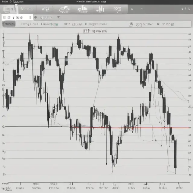
Vertical line charts are a powerful tool for technical traders, offering numerous insights through their unique representation of security prices. By understanding the various strategies that leverage vertical line charts, you can significantly enhance your ability to make informed trades and capitalize on market trends.
Support and Resistance Levels
One common trading strategy involves identifying support and resistance levels in a vertical line chart. Support levels represent price levels where demand for a security is strong enough to prevent significant declines. Conversely, resistance levels indicate prices at which supply pressure is high enough to prevent significant advances. These levels can be identified by analyzing previous price action and trends.
Chart Patterns
Another valuable strategy using vertical line charts is the recognition of chart patterns. These formations can offer insights into potential future price movements. Common chart patterns include head and shoulders, triangles, double tops and bottoms, and flags or pennants. These patterns may indicate bullish or bearish trends in the making, providing valuable information for traders looking to enter or exit positions based on price action.
Trend Analysis
Vertical line charts can also be used for trend analysis, helping to identify uptrends, downtrends, and potential reversals. By closely examining vertical bars’ lengths and their trends, traders can make informed decisions about entering and exiting trades based on the prevailing market conditions. Additionally, combining vertical line chart analysis with other technical indicators, such as moving averages or RSI (Relative Strength Index), can provide a more comprehensive view of market trends and help to confirm potential buy or sell signals.
Customization and Interpretation
It is essential to remember that trading strategies using vertical line charts are subjective. The interpretation of these charts depends on the trader’s analysis and experience, as well as their personal risk tolerance and goals. Customizing the chart by adjusting time frames and data points can help traders gain a deeper understanding of market dynamics and make more informed decisions.
In conclusion, vertical line charts offer a wealth of information for technical traders looking to navigate the complex world of financial markets. By utilizing strategies such as support and resistance levels, chart patterns, and trend analysis, traders can capitalize on market trends and make well-informed trades that maximize their potential profits. As with all trading strategies, it is crucial to thoroughly understand the risks involved and to approach the markets with discipline and patience.
Example: A Deep Dive into a Vertical Line Chart
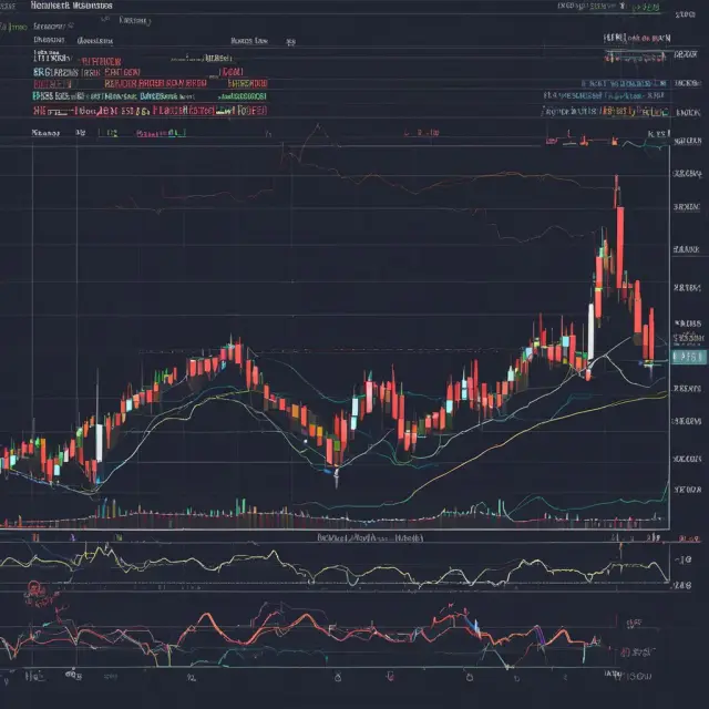
A vertical line chart, also known as a bar chart or OHLC (Open-High-Low-Close) chart, is an essential tool for traders seeking to understand the price movement of a security. The following example of Alphabet Inc.’s (GOOG) daily price action, displayed as a vertical line chart, demonstrates how this powerful visualization technique can reveal valuable insights (as shown in Figure 1).
Figure 1: A three-month vertical line chart representing the daily price movement of Alphabet Inc. (GOOG)
In this chart, each vertical line represents a single trading day. The top and bottom of the line correspond to the highest and lowest prices, respectively, during that specific time frame. The short horizontal bars situated on the left and right sides represent the opening and closing prices for each day, providing a quick overview of the price range within the specified period.
The chart reveals an uptrend from early February through late April 2023, characterized by long vertical lines with rising highs and closing prices. Conversely, during mid-March and mid-April, the trend is seen to reverse momentarily with shorter vertical lines depicting lower closing prices compared to their opening prices, indicating selling pressure.
Understanding the differences between long and short vertical bars can provide essential context for market analysis. Longer lines represent significant price movements, whereas shorter lines indicate more subtle changes within the period. In this example, the extended green line in mid-March marks a particularly large price increase, demonstrating strong buying interest during that time.
Comparing vertical line charts to other visualization methods, like line charts, can yield further insight into market dynamics. Line charts represent only closing prices and do not provide information on opening and low prices for each period. By contrast, vertical line charts offer a more comprehensive view of price movement throughout the day and allow traders to make informed decisions based on various data points.
In conclusion, mastering the art of interpreting vertical line charts can significantly enhance a trader’s ability to understand the intricacies of market behavior and capitalize on trading opportunities effectively. However, it is crucial to remember that chart analysis should not be relied upon in isolation; combining it with other forms of fundamental and technical analysis provides a more holistic approach to successful investing and trading strategies.

Importance of Combining Charting with Other Analysis Methods
While vertical line charts provide valuable insights into a security’s historical price movements, they should not be the sole tool for making investment decisions. Instead, traders often combine charting techniques with other forms of analysis to gain a more comprehensive understanding of market trends and potential trading opportunities. Two common methods used in conjunction with charting are technical indicators and fundamental analysis.
Technical Indicators: Technical indicators provide additional insights into price movements, helping to identify trends, momentum, volatility, and other patterns that may not be immediately apparent from a vertical line chart. Popular technical indicators include moving averages, Bollinger Bands, Relative Strength Index (RSI), Moving Average Convergence Divergence (MACD), and Stochastic Oscillator. These indicators are plotted on the same chart as the price action data, providing visual cues that help to confirm trends or signal potential buy or sell opportunities.
Fundamental Analysis: Fundamental analysis, on the other hand, focuses on the underlying financial and economic conditions of a company or market, rather than just its price movements. This approach involves analyzing various quantitative and qualitative factors that can impact a security’s value, such as earnings reports, interest rates, economic indicators, and management decisions. By combining fundamental analysis with vertical line charting, traders can gain insights into the reasons behind price movements, helping to inform investment strategies and manage risk.
Moreover, it’s essential to understand that there is no single “best” method for analyzing financial markets. Each approach has its strengths and limitations. Charting is helpful in identifying trends and patterns, while technical indicators provide additional insights into market conditions. Fundamental analysis offers a deeper understanding of the underlying factors driving price movements. By combining these methods, traders can gain a more complete perspective on the market, allowing for more informed decision making.
In summary, vertical line charting is an essential tool for technical traders and market technicians, providing insights into historical price movements and trends. However, it should not be used in isolation. To make well-informed investment decisions, it’s crucial to combine charting with other forms of analysis such as technical indicators and fundamental analysis. By doing so, traders can gain a more comprehensive understanding of market conditions and identify potential trading opportunities, helping to mitigate risk and maximize returns.
FAQs on Vertical Line Charting
Vertical line charting, often referred to as bar charts or OHLC (Open, High, Low, Close) charts, is a crucial tool for technical traders seeking to analyze price movements over a defined time period. Here, we answer some frequently asked questions about this essential financial visualization technique.
Q: What does a vertical line chart represent?
A: A vertical line chart displays the price action of an asset or security by summarizing its highs, lows, open, and closing prices over a specified duration. The high and low points are denoted by the top and bottom of the line, while the opening and closing prices are represented by short horizontal bars to the left and right, respectively.
Q: How does vertical line charting help traders?
A: Vertical line charts offer valuable insights into price behavior by revealing trends, support and resistance levels, and potential chart patterns that can guide informed trading decisions.
Q: What’s the difference between vertical line charts and line charts?
A: Line charts represent the closing prices of an asset for a given time frame, while vertical line charts include additional data points such as highs, lows, opens, and closes. The visual representation varies significantly, with line charts displaying continuous price movement as a line connecting each closing price, whereas vertical line charts offer distinct bars for each period.
Q: How do I customize my vertical line chart?
A: You can customize your vertical line chart by adjusting the time frame, selecting data points to show (open, high, low, close), and changing colors for an enhanced visual experience. Platforms like TradingView provide extensive customization options tailored to traders’ preferences.
Q: What are some advantages of using a vertical line chart?
A: Vertical line charts offer several benefits such as clear price movement representation, easy identification of high and low points, and the ability to recognize patterns and trends over various time frames. Additionally, customization features allow for personalized data visualization to cater to individual trading strategies.
Q: What are some disadvantages or limitations of vertical line charting?
A: Vertical line charts may display a large amount of information at once, potentially overwhelming less experienced traders. Additionally, relying solely on price movements and historical data for analysis can be risky as market conditions change and trends shift. It’s essential to consider combining vertical line charts with other analytical tools such as technical indicators and fundamental analysis for a more comprehensive approach to trading.
Q: Can I only use a vertical line chart for trend analysis?
A: While trend analysis is an important aspect of using vertical line charts, these visualizations can also aid in identifying support and resistance levels and pinpointing various chart patterns. They offer versatility for traders seeking valuable insights into price movements.
In conclusion, understanding the nuances of vertical line charting and how it complements other analytical techniques is a vital step towards becoming an effective trader. By answering these FAQs, we’ve provided a solid foundation for further exploration into this essential tool for financial analysis.
 Next entry · No. 5,476Understanding Vertical Integration: Advantages, Disadvantages, and How It Works in Finance and Investment
See also
-
 No. 5,074
09 Aug 2025
26 min
Understanding and Implementing Effective Trend Trading Strategies in Finance and Investment
Business Finance
No. 5,074
09 Aug 2025
26 min
Understanding and Implementing Effective Trend Trading Strategies in Finance and Investment
Business Finance -
 No. 5,774
06 Oct 2025
20 min
A Comprehensive Guide to Understanding and Utilizing Worden Stochastics in Finance and Investment
Business Finance
No. 5,774
06 Oct 2025
20 min
A Comprehensive Guide to Understanding and Utilizing Worden Stochastics in Finance and Investment
Business Finance -
 No. 5,086
10 Aug 2025
21 min
Understanding and Trading the Triple Bottom Chart Pattern: A Bullish Reversal Indicator for Institutional Investors
Financial Tools
No. 5,086
10 Aug 2025
21 min
Understanding and Trading the Triple Bottom Chart Pattern: A Bullish Reversal Indicator for Institutional Investors
Financial Tools -
 No. 5,922
18 Oct 2025
18 min
Understanding the Zone of Resistance: Technical Analysis for Institutional Investors
Financial Data Analysis
No. 5,922
18 Oct 2025
18 min
Understanding the Zone of Resistance: Technical Analysis for Institutional Investors
Financial Data Analysis -
 No. 5,559
19 Sep 2025
18 min
Understanding the Volume-Weighted Average Price (VWAP) in Finance and Investment: A Comprehensive Guide for Institutional Traders
Financial Data Analysis
No. 5,559
19 Sep 2025
18 min
Understanding the Volume-Weighted Average Price (VWAP) in Finance and Investment: A Comprehensive Guide for Institutional Traders
Financial Data Analysis -
 No. 5,165
16 Aug 2025
19 min
Understanding Unconditional Probability: A Key Concept in Finance and Investment
Financial Data Analysis
No. 5,165
16 Aug 2025
19 min
Understanding Unconditional Probability: A Key Concept in Finance and Investment
Financial Data Analysis