Understanding Up/Down Gap Side-by-Side White Lines in Finance: A Comprehensive Guide

Learn about up/down gap side-by-side white lines in finance, their bullish and bearish continuation patterns, real-life examples, limitations, and applications.
Introduction to Up/Down Gap Side-by-Side White Lines
The up/down gap side-by-side white lines pattern is an intriguing yet significant three-candle continuation formation that can provide valuable insights for both short-term and long-term investors in the stock market. This powerful candlestick pattern occurs on a chart when the price action exhibits a notable gap, followed by two white or doji candles with similar body sizes. In this comprehensive guide, we will dive deep into understanding up/down gap side-by-side white lines’ definition, key characteristics, and importance in finance.
Understanding Up/Down Gap Side-by-Side White Lines: What They Represent
The up/down gap side-by-side white lines pattern is a continuation formation that can be identified by its specific arrangement on candlestick charts. The up version consists of a large white candle, followed by a gap up and two more white candles of similar size. Conversely, the down version consists of a large black candle, followed by a gap down and two more white or doji candles of equivalent body sizes.
The primary significance of this pattern lies in its strong correlation with the underlying trend, as it indicates that the price is expected to continue moving in the same direction as the first candle (bullish for up gaps and bearish for down gaps). However, it’s important to note that while these patterns are moderately accurate, they do not always result in significant price movements or long-term trends.
Key Characteristics of Up/Down Gap Side-by-Side White Lines
The following key characteristics define up/down gap side-by-side white lines:
- Three-candle formation: The pattern consists of three candles that include a large real body candle, followed by a gap (up for bullish continuation or down for bearish continuation) and then two similar-sized white or doji candles.
- Trend continuation: Up/down gap side-by-side white lines are considered continuation patterns because they suggest that the trend will continue in the same direction as indicated by the first candle (up for bullish continuation, down for bearish continuation).
- Moderate reliability: These patterns have a moderate level of accuracy in predicting the direction of the price movement following the pattern, making them valuable but not definitive indicators.
- Rare occurrence: Up/down gap side-by-side white lines are relatively uncommon, which makes their identification and application in trading strategies challenging but rewarding for skilled investors.
- Confirmation required: To increase confidence in trading decisions based on up/down gap side-by-side white lines, it’s crucial to confirm the pattern with other technical indicators or signals.
Importance of Up/Down Gap Side-by-Side White Lines in Finance
The up/down gap side-by-side white lines pattern holds significant importance in finance for several reasons:
- Trend continuation: By indicating a continuation of the underlying trend, up/down gap side-by-side white lines can help investors make informed decisions about entering or exiting trades at the right time based on their risk tolerance and investment objectives.
- Psychological significance: The pattern reflects the collective emotions of buyers and sellers in the market, providing insights into their confidence levels and expectations for future price movements.
- Risk management: By using up/down gap side-by-side white lines as part of a comprehensive trading strategy, investors can effectively manage risk by setting stop losses and taking profits at appropriate levels based on the pattern’s potential price targets.
- Market awareness: Keeping an eye out for up/down gap side-by-side white lines allows investors to stay informed about significant market movements and trends, helping them adapt their strategies accordingly.
- Trading opportunities: The rare occurrence of these patterns creates unique opportunities for traders to capitalize on potential price swings and profit from the continuation of trends in various financial markets.

Up Version: Bullish Continuation Pattern
The up/down gap side-by-side white lines is a fascinating and powerful three-candle continuation pattern in finance that can be found on candlestick charts. The up version, specifically, is characterized by a bullish trend, with a large white (or green) candle followed by a gap up and then two more white candles of similar size. This intriguing pattern offers valuable insights into the market dynamics and the possible continuation or confirmation of an ongoing uptrend.
A bullish continuation occurs when the first candle represents a strong move upward, often referred to as a “white” or “bullish” candle, with the open and close prices well above the midpoint of the session’s range. This initial surge in price indicates an increase in buying demand and investor confidence. The second candle follows suit by opening above the previous close due to the gap up, demonstrating further bullish momentum. Lastly, the third candle is a white candle with a real body that holds the size and length of the preceding candle or remains quite close. This consistency signifies a strong underlying trend and a diminishing bearish influence, indicating potential for continued price gains.
The reliability of up gap side-by-side white lines as a bullish continuation pattern is moderate but significant, as it provides an essential confirmation signal for ongoing uptrends. Although these patterns are relatively uncommon, they can be invaluable when utilized correctly and in conjunction with other technical indicators or charting tools. For instance, a trader may wait for the price to move above the high of this formation before initiating a long position to further boost confidence that an uptrend will continue.
The psychological factors behind an up gap side-by-side white lines pattern are rooted in the collective emotions and perceptions of market participants. Bullish traders, who are optimistic about a security’s future price direction, experience increased confidence during an uptrend, with each subsequent bullish candle adding to their resolve. The first candle represents a strong push upwards due to favorable market conditions or news. As the gap occurs on the second day, bullish sentiment intensifies, as traders anticipate further gains, causing the price to open even higher. The third candle, with its similar size and length as the preceding candle, reflects diminishing bearish power and a growing sense of confidence among buyers that the uptrend will persist.
It’s important to note that an up gap side-by-side white lines pattern does not guarantee a specific price target or a significant price move every time it appears. Market conditions, other technical indicators, and external factors can influence the overall trend and potential profitability of a trade. To maximize success, traders should be prepared to wait for confirmation signals like price breakouts or rejections before entering new positions. Additionally, proper risk management, such as stop losses and position sizing, is vital in minimizing potential losses and maintaining a well-diversified portfolio.
An example of an up gap side-by-side white lines pattern can be observed on the daily chart of Apple Inc. (AAPL). In this instance, the price displays a bullish trend after an initial swing low, with a large upward gap followed by two more white candles of similar size, providing a clear indication of the underlying trend’s strength and potential for continued gains. The subsequent confirmation of the pattern occurs when the fourth candle opens above the highs of the first three candles, further solidifying the uptrend.

Down Version: Bearish Continuation Pattern
The down version of the up/down gap side-by-side white lines pattern is a bearish continuation pattern that can be identified on candlestick charts (Figure 1). This three-candle formation comprises a large black candle, followed by a gap down and two similar-sized white candles. The key characteristics of this bearish continuation pattern are discussed below.
Characteristics:
- Market in a downtrend: A confirmed downtrend is the fundamental requirement for this pattern to appear. This means the overall trend direction must be downward, with the first candle being part of that trend.
- Large black first candle: The first candle represents the initial sell-off and sets the stage for the subsequent bearish continuation. A large real body is crucial as it indicates a significant price decrease.
- Gap down: The second candle opens below the close of the preceding large bearish candle, creating a noticeable gap on the chart. This gap indicates a significant selling pressure that intensified overnight or between trading sessions.
- Two small white candles with similar size: After the gap down, two smaller white candles follow, both having real bodies comparable in length to each other. These white candles indicate that although sellers were successful in creating a bearish gap, buyers managed to push prices back up slightly during this period.
Reliability and Psychology
The down version of the up/down gap side-by-side white lines pattern is considered a moderately reliable continuation pattern. It tends to indicate that the downtrend is likely to persist after the formation, although it may not necessarily result in substantial price declines. The psychology behind this bearish continuation pattern can be explained as follows:
- Confirmation of the downtrend: The large black candle at the beginning of the pattern confirms the existing downtrend and signals a strong selling pressure from the market participants, making it an ideal entry point for short positions.
- Gap down: The gap down further highlights the intensity of the selling pressure that caused a significant price move lower during the previous trading session or overnight.
- Containment of price decline: Despite the bearish signal given by the gap down, buyers managed to limit the price decrease, which can be seen in the two small white candles. This suggests that there is some underlying support or buying pressure in place, leading traders and investors to expect a continuation of the downtrend but with reduced volatility.
Example:
Figure 2 depicts an example of the down version of the up/down gap side-by-side white lines pattern occurring on the daily chart for NVIDIA Corporation (NVDA) during a significant downturn in the stock market in early 2016. This pattern provided clear confirmation of the prevailing downtrend and offered opportunities to enter short positions, potentially with a stop loss above the gap down high or near the highest low of the two white candles.
Limitations:
Although the down version of the up/down gap side-by-side white lines pattern is an essential continuation signal, it does come with some limitations:
- Rare occurrence: This pattern appears less frequently than other chart patterns or common price movements, making it more difficult to find and apply in real trading situations.
- Moderate reliability: While this bearish continuation pattern can be a useful tool for identifying potential trend reversals or continuations, its reliability is not absolute. It may not always result in significant price moves, so traders should consider confirming the signal with other indicators or analysis methods to improve their chances of success.
In conclusion, the down version of the up/down gap side-by-side white lines pattern represents a bearish continuation signal that can be used by traders and investors to identify potential trend reversals or continuations in a downtrend. By understanding its characteristics, reliability, psychology, and limitations, you will be better prepared to make informed trading decisions based on this valuable chart pattern.
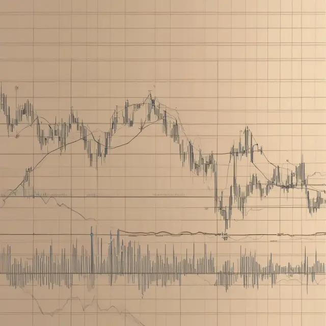
Example of Up Gap Side-by-Side White Lines: Apple Inc.
One of the most compelling examples of the up gap side-by-side white lines pattern can be observed in the daily chart of Apple Inc. (AAPL) during a significant bullish period. This three-candle continuation pattern demonstrates the power and potential of this intriguing market phenomenon.
First, it is important to understand the structure of the up gap side-by-side white lines. Following an uptrend, the first candle in this pattern typically exhibits a strong bullish move, as indicated by a large white or green real body with a close higher than its open. The second candle, which often forms during periods of increased volatility, presents a gap up, representing a significant price increase from one day to another. Finally, the third candle displays two consecutive white candles, both of similar size and strength, which mirror each other. This pattern indicates bullish sentiment and reinforces the continuation of the current trend (Figure 1).
In the case of AAPL, this pattern emerged as the stock price rebounded from a swing low in December 2018, marking the beginning of a powerful uptrend. The first candle presented a large bullish move with a real body length of approximately 50 points and a close that decisively surpassed its open. This candle not only confirmed the prevailing bullish trend but also provided a solid base for the subsequent price action (Figure 2).
The second candle, characterized by an up gap, reflected the accelerating momentum in AAPL’s favor as the price surged past crucial resistance levels and gained significant traction. The gap represented an intraday disconnect between the opening and closing prices of this candle, emphasizing the intense buying pressure (Figure 3).
Subsequently, the third candle formed two consecutive white candles, each boasting real bodies comparable in length to that of the second candle. This consolidation phase allowed the bullish sentiment to continue to gain ground, providing a brief respite from the relentless upward price movement (Figure 4).
The next day (the fourth candle), AAPL continued its impressive rally by closing above the highs of candles two and three, offering confirmation that the bullish trend was indeed continuing. The strength of this bullish continuation pattern can be attributed to a multitude of factors, including strong company fundamentals, favorable market conditions, and positive investor sentiment (Figure 5).
In conclusion, the up gap side-by-side white lines pattern in Apple Inc.’s daily chart serves as an excellent example of how this powerful continuation pattern can be employed to identify potential opportunities for bullish trades. By recognizing and understanding this three-candle configuration, traders can gain a distinct edge when navigating the financial markets and make informed decisions based on solid technical analysis.

Limitations and Challenges of Up/Down Gap Side-by-Side White Lines
The up/down gap side-by-side white lines is a less commonly observed yet powerful continuation pattern on candlestick charts. This three-candle formation, consisting of an initial large candle followed by a gap and two subsequent identical-sized candles, carries several limitations and challenges that investors should be aware of to fully grasp its potential.
Rare Occurrences
One of the most significant challenges with up/down gap side-by-side white lines is their infrequency. These patterns are not as common compared to other technical chart formations. As a result, traders may encounter fewer opportunities to employ this strategy in their investment decisions. However, it is essential to remember that rarity does not equate to insignificance. When these patterns do occur, they can offer valuable insights into market trends and price movements.
Moderate Reliability
Though up/down gap side-by-side white lines are useful indicators of potential trend continuation, their reliability is moderate. The pattern suggests that the market will most likely follow the direction of the initial large candle’s trend—whether bullish or bearish. However, not all cases result in substantial price movements after the formation of this pattern. In some instances, the subsequent candles may present weak trends with minimal price action. This inconsistency underscores the importance of applying additional technical indicators to complement the pattern and increase overall confidence in potential trade decisions.
Lack of Price Targets
Another challenge investors face when dealing with up/down gap side-by-side white lines is the absence of an automatic price target. These patterns do not provide a clear exit strategy or definitive profit-taking level. This limitation requires traders to closely monitor the market and other technical indicators for signals that confirm trend continuation and offer appropriate entry and exit points. Consequently, investors must employ additional strategies and analysis tools to maximize their returns when trading off these patterns.
In conclusion, understanding up/down gap side-by-side white lines is crucial for investors looking to make informed decisions in the ever-evolving financial markets. By recognizing their rarity, moderate reliability, and lack of price targets, traders can develop a more comprehensive approach to employing this powerful continuation pattern as part of their investment strategy.

Confirmation and Complementary Techniques
Maximizing the potential success of up/down gap side-by-side white lines as a continuation pattern relies on its confirmation using complementary technical indicators or signals. By doing so, traders increase their odds of identifying a trend continuation rather than an isolated occurrence. In this section, we explore the significance and benefits of confirming up/down gap side-by-side white lines using various techniques and indicators.
Up Version: Bullish Continuation Pattern Confirmation
The bullish continuation pattern, which is represented by the up gap side-by-side white lines, signifies that an uptrend is expected to persist following the appearance of this three-candle pattern. To further strengthen this assessment, it’s advisable for traders to confirm the bullish outlook with other technical indicators or signals.
One such indicator that can complement the up gap side-by-side white lines bullish continuation pattern is the Moving Average Convergence Divergence (MACD). When the MACD histogram generates a positive crossover following this pattern, it reinforces the likelihood of an uptrend continuation.
Another popular confirmation indicator is the Relative Strength Index (RSI), which measures the strength of price action within a particular timeframe. After the appearance of the up gap side-by-side white lines pattern, an RSI reading below 70 indicates that the asset may still be oversold, and a subsequent rebound could continue the uptrend.
Down Version: Bearish Continuation Pattern Confirmation
On the flip side, when a downward trend is indicated by a bearish continuation pattern like the down gap side-by-side white lines, it’s important for traders to seek confirmation from other indicators to minimize false signals and potential losses.
For instance, if a downward trend is evident following the down gap side-by-side white lines pattern, an effective indicator for confirming this continuation is the Bollinger Bands. A widening of the bands and subsequent price action below them following the appearance of this pattern can serve as a strong confirmation signal that the downtrend will continue.
Another useful tool for identifying bearish trends and verifying the down gap side-by-side white lines pattern is the Stochastic Oscillator. If the %K line crosses below the %D line following the appearance of this pattern, it may indicate an overbought condition and a potential reversal, further supporting the downtrend continuation.
In conclusion, employing up/down gap side-by-side white lines as a standalone tool might lead to inaccurate assessments and missed opportunities. Instead, it’s crucial for traders to supplement their analysis with complementary technical indicators or signals to maximize the effectiveness of this continuation pattern. By doing so, they can improve their odds of identifying reliable trend continuations and making informed trading decisions.

Visualizing Up/Down Gap Side-by-Side White Lines on a Candlestick Chart
The up/down gap side-by-side white lines pattern is a three-candle continuation pattern easily identifiable on candlestick charts. This intriguing technical analysis tool offers insight into potential price movement continuity in uptrends or downtrends. In this section, we will illustrate how to decipher the up/down gap side-by-side white lines visually.
To recognize an up gap side-by-side white lines pattern, search for a bullish trend where a large, white or green candle is preceded by a gap and followed by two more similar sized white candles (Figure 1). The first candle represents the rally, while the second candle indicates a potential continuation of the uptrend due to the gap up. The third candle’s real body signifies diminishing bearish influence and further strengthens the bullish resolve.
Down gap side-by-side white lines are characterized by a downtrend with a large, black or red candle followed by a gap down and two subsequent smaller white candles (Figure 2). The first candle represents the decline while the second candle’s gap down indicates a potential continuation of the downtrend due to the selling pressure. The third candle’s real body signifies diminishing bullish influence, which further strengthens the bearish resolve.
Up Gap Side-by-Side White Lines Example
Let us consider an example of the up gap side-by-side white lines pattern using the daily chart of Apple Inc. (AAPL) to demonstrate its potential significance in confirming a bullish trend continuation (Figure 3). Here, we observe a large white candle forming after a swing low, followed by a gap and two more white candles with similar sizes. The subsequent price action moves above the highs of candles two and three, providing confirmation that the uptrend is continuing.
Limited Occurrence
The up/down gap side-by-side white lines pattern is not frequently observed on charts; however, its significance lies in the fact that it can offer valuable insights into potential trend continuation. Being aware of this pattern’s existence and being able to identify it when it presents itself is essential for traders who seek to make informed decisions based on price movement patterns.
In conclusion, up/down gap side-by-side white lines are an intriguing three-candle continuation pattern that can provide valuable information regarding potential trend continuity in both uptrends and downtrends. By visualizing these patterns on candlestick charts, traders can gain a deeper understanding of the market’s underlying dynamics and potentially profit from informed decisions.

Up Gap vs. Down Gap: Differences between Continuation Patterns
The up gap side-by-side white lines pattern and down gap side-by-side white lines pattern are two continuation patterns that occur on candlestick charts, indicating a potential price direction following the formation of these bullish or bearish patterns. While both patterns share common characteristics, they differ significantly in terms of their structure and implications for traders.
The up version is a bullish continuation pattern, while the down version is a bearish continuation pattern. The primary difference between the two lies within the trend direction that precedes these patterns—up or down. Understanding how each version forms and behaves can be crucial in determining the market’s future movements.
Up Gap Side-by-Side White Lines: A Bullish Continuation Pattern
The up gap side-by-side white lines pattern, as mentioned earlier, is a bullish continuation pattern characterized by three consecutive candles. This pattern includes a large up candle followed by a gap and two white candles of similar size, which reinforces the underlying uptrend. The price action within this pattern suggests that buying pressure has been strong enough to push the market higher after an initial significant gain.
The psychological implications of the up gap side-by-side white lines pattern are noteworthy: during an uptrend, bulls might become increasingly confident with each bullish candlestick formation, and a large up candle signals a strong buying pressure. The gap represents a lack of sellers in the market to counteract this trend-continuing momentum. The two subsequent white candles further confirm that buyers remain in control as they hold above the gap, which is a clear signal for traders looking to enter long positions or strengthen existing ones.
Down Gap Side-by-Side White Lines: A Bearish Continuation Pattern
The down version of this pattern, conversely, is a bearish continuation pattern. This three-candle formation consists of a large down candle followed by a gap and two white candles of similar size. When this pattern occurs in a downtrend, it can signal that selling pressure remains strong after an initial significant decline.
The psychological implications of the down gap side-by-side white lines pattern are also worth considering during a downtrend: bears might gain confidence with each bearish candlestick formation and a large down candle signals a strong selling pressure. The subsequent gap represents a lack of buyers to counteract this trend-continuing momentum, and the two following white candles further confirm that sellers remain in control as they hold below the gap.
Comparing Up Gap and Down Gap Side-by-Side White Lines Patterns
In summary, the up and down gap side-by-side white lines patterns are continuation patterns that provide traders with essential information about market sentiment and potential future price movements. While they both share a three-candle structure, their differences lie within their trend direction and resulting bullish or bearish implications. Understanding these patterns can help investors make more informed decisions when navigating the financial markets.
Keep in mind that these patterns are not foolproof indicators, but rather tools that should be used alongside other technical analysis methods and confirmation signals for maximum accuracy. Also, while they provide useful information on potential future price direction, neither pattern offers a specific price target. Ultimately, it is up to the trader to determine when to enter or exit positions based on their personal risk tolerance and investment objectives.

Applications in Trend Trading Strategies
As we’ve explored, up/down gap side-by-side white lines are a relatively rare continuation pattern with moderate reliability. Traders may use this knowledge to their advantage by incorporating the pattern into their trend trading strategies. In this section, we will discuss how to apply up/down gap side-by-side white lines in the context of an uptrend and a downtrend.
In an Uptrend
During an uptrend, when the market is generally moving higher, traders can look for up gap side-by-side white lines as confirmation that the trend will likely continue. This pattern signals strong bullish sentiment and increasing demand for the security. Following an up gap side-by-side white lines occurrence, a trader might consider entering a long position with the expectation of further price appreciation. A stop loss could be placed below the low of the second or third candle to protect from potential losses.
It is essential to note that while this pattern can be useful in an uptrend, it should not be considered in isolation. Incorporating other technical indicators and confirmation signals will strengthen the overall analysis. For instance, traders might look for bullish divergence between the RSI (Relative Strength Index) or Stochastic Oscillator and the price action to confirm a potential trend continuation.
In a Downtrend
During a downtrend, when the market is generally moving lower, up gap side-by-side white lines can appear misleading due to their bullish nature. However, it’s important not to disregard them entirely. If the pattern emerges in a downtrend, traders may view it as an opportunity to enter a short position or add to existing shorts.
Once again, it is crucial to rely on multiple indicators and confirmation signals when interpreting up/down gap side-by-side white lines in a downtrend. For example, a trader might look for bearish divergence between the RSI or Stochastic Oscillator to confirm potential weakness in the security’s price trend.
As a reminder, no single technical indicator is infallible, and up/down gap side-by-side white lines should be used as part of a holistic approach when making trading decisions. Traders must also consider factors like market sentiment, economic data releases, and other fundamental analysis to increase the likelihood of successful trades.

FAQs: Up/Down Gap Side-by-Side White Lines Frequently Asked Questions
What is a side-by-side white lines pattern in finance?
The up/down gap side-by-side white lines pattern is a three-candle continuation configuration that occurs on candlestick charts. It features an initial large candle followed by a gap and two subsequent similar-sized candles in the same direction as the trend.
Is this pattern reliable for predicting market movements?
Yes, the side-by-side white lines pattern is considered a moderately reliable continuation indicator; however, it does not guarantee future price direction.
What are the up and down versions of this pattern?
The up version consists of a large bullish candle, an opening gap, and two smaller bullish candles following the gap. In contrast, the down version features a large bearish candle, a closing gap, and two smaller bearish candles that follow the gap.
How does the side-by-side white lines pattern form psychologically?
The upside pattern in an uptrend indicates increasing bullish confidence, while the downside pattern during a downtrend shows waning bearish resolve.
What is the significance of a confirmed up/down gap side-by-side white line pattern?
Confirming this pattern with other indicators or signals can increase its reliability and help maximize the odds of successful trades. Waiting for confirmation before entering a position can be beneficial.
How does a side-by-side white lines pattern compare to three outside up/down candlestick patterns?
Unlike the three outside up/down candlesticks, which are reversal patterns, side-by-side white lines are continuation patterns. The latter confirms that the existing trend will likely persist, while the former may signify a potential price reversal.
In what situations can the pattern be used effectively?
Traders can use this pattern to enter positions in a confirming trend and set stop losses to minimize risk. It is essential to consider market conditions and other indicators before making trades based on this pattern alone.
What are the limitations of side-by-side white lines patterns?
While moderately reliable, these patterns occur infrequently and may not provide a clear price target for investors. It is crucial to combine them with other analysis tools and signals to enhance their overall effectiveness.
 Next entry · No. 5,330Understanding Upfront Pricing in Credit Cards: Interest Rates and Credit Limits
See also
-
 No. 5,336
31 Aug 2025
22 min
Understanding the Upside Gap Two Crows Pattern: A Bearish Reversal Signal
Markets
No. 5,336
31 Aug 2025
22 min
Understanding the Upside Gap Two Crows Pattern: A Bearish Reversal Signal
Markets -
 No. 4,961
31 Jul 2025
22 min
Understanding the Three Black Crows Candlestick Pattern – A Predictor of Market Reversals
Markets
No. 4,961
31 Jul 2025
22 min
Understanding the Three Black Crows Candlestick Pattern – A Predictor of Market Reversals
Markets -
 No. 5,774
06 Oct 2025
20 min
A Comprehensive Guide to Understanding and Utilizing Worden Stochastics in Finance and Investment
Business Finance
No. 5,774
06 Oct 2025
20 min
A Comprehensive Guide to Understanding and Utilizing Worden Stochastics in Finance and Investment
Business Finance -
 No. 5,731
03 Oct 2025
19 min
Mastering Wilder’s DMI (ADX) Indicator: A Powerful Tool for Trend Analysis in Finance and Investment
Business Finance
No. 5,731
03 Oct 2025
19 min
Mastering Wilder’s DMI (ADX) Indicator: A Powerful Tool for Trend Analysis in Finance and Investment
Business Finance -
 No. 5,074
09 Aug 2025
26 min
Understanding and Implementing Effective Trend Trading Strategies in Finance and Investment
Business Finance
No. 5,074
09 Aug 2025
26 min
Understanding and Implementing Effective Trend Trading Strategies in Finance and Investment
Business Finance -
 No. 5,032
06 Aug 2025
20 min
Understanding Trading Strategies: Technical, Fundamental and Quantitative Approaches
Business Finance
No. 5,032
06 Aug 2025
20 min
Understanding Trading Strategies: Technical, Fundamental and Quantitative Approaches
Business Finance